Just as a nation’s flag expresses the distinct identity of a country, so, too, a logotype — typically a symbol or letters — helps to establish the name and define the character of a corporation. Effective logos become synonymous with the organizations they portray. They are instantly recognized by millions of people, and help to identify their companies and convey a message about the brands for which they stand.
Down through the years, IBM (and its predecessor companies) has used a series of logos on signs, stationery, vehicles, products — and even flags — to make a distinctive statement and foster immediate recognition all over the world. Here are those logos.
The International Time Recording Company (ITR) began as the Bundy Manufacturing Company in Auburn, New York. ITR’s main product line were mechanical time recorders invented and patented by Willard L. Bundy in 1888. ITR was later merged into the Computing-Tabulating-Recording Company — the forerunner of IBM — in 1911.
In 1891, Edward Canby and Orange O. Ozias, two businessmen from Dayton, Ohio, purchased the patents for the newly invented computing scale and incorporated the Computing Scale Company for the production of commercial scales
In 1911, financier Charles R. Flint directed the merger of the International Time Recording Company, the Computing Scale Company and the Tabulating Machine Company to form the Computing-Tabulating-Recording Company (CTR). In 1914 Thomas J. Watson, Sr., was named general manager of CTR. Watson emphasized research and engineering, and introduced into the company his famous motto “THINK.”
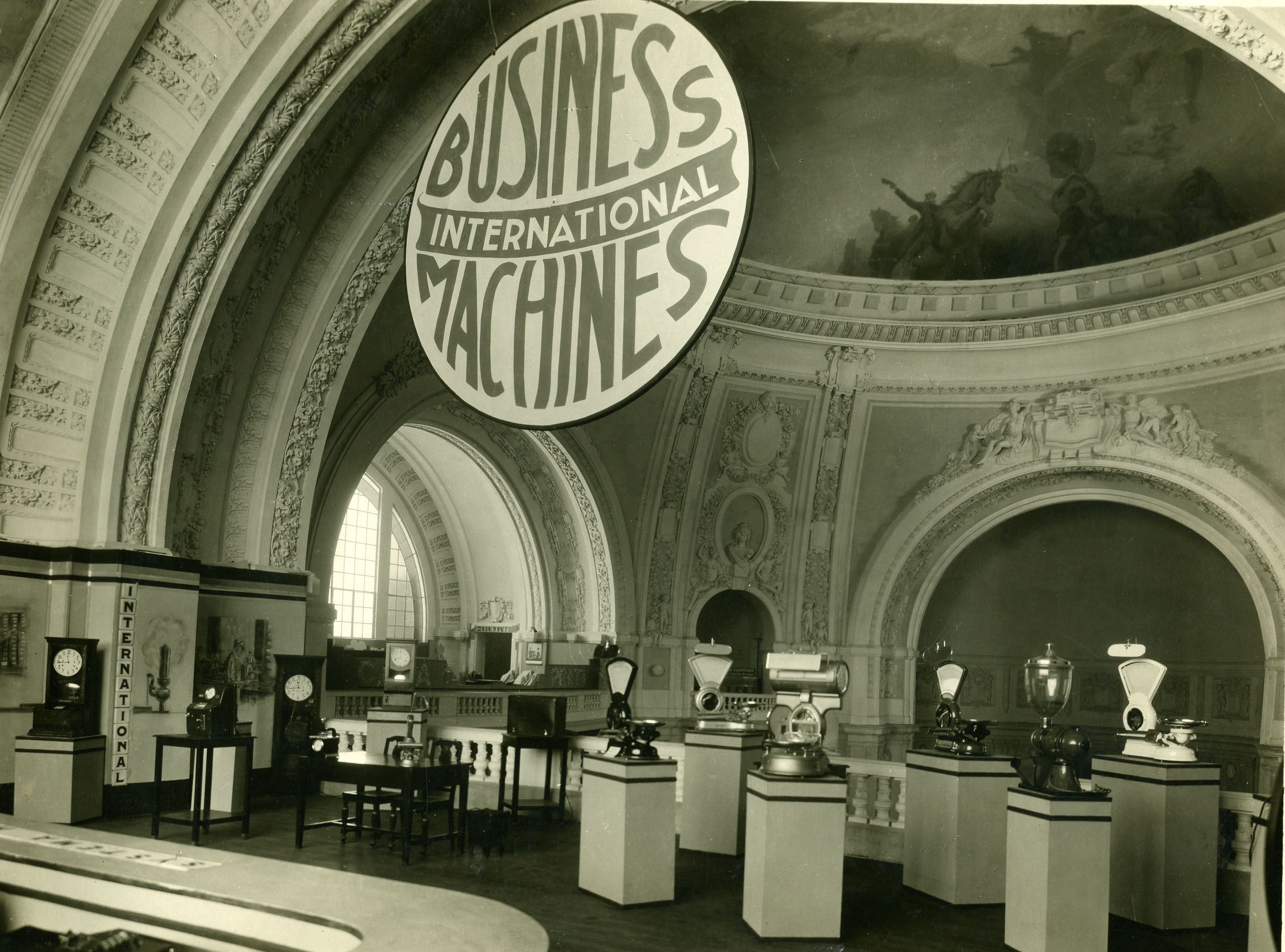
In 1924, the Computing-Tabulating-Recording Company adopted the name International Business Machines Corporation. The ornate, rococo letters that formed the “CTR” logo were replaced by the words “Business Machines” in more contemporary sans-sarif type, and in a form intended to suggest a globe, girdled by the word “International.”
IBM borrowed on the equities in its brand image and reputation to help carry it through a difficult transition from the punched-card tabulating business to computers. It began with a change to the logotype, the first in 22 years. The new logo appeared on the masthead of the January 1, 1947 issue of Business Machineswith surprisingly little fanfare. The familiar “globe” was replaced with the simple letters “IBM” in a typeface called Beton Bold.
In May 1956, shortly before he died, Thomas J. Watson, Sr., presided over the official installation of his son as IBM’s chief executive. Tom Watson, Jr. moved quickly, using both actions and symbols to signify a new era. The first visible expression was a relatively subtle change in the company’s logotype subtle, in part, to communicate that any changes would come within an overall continuity. Created by noted graphic designer Paul Rand, the new logotype replaced the former Beton Bold typography with City Medium, as the letters “IBM” took on a more solid, grounded and balanced appearance.
In 1972, the company introduced a new version of the logotype. Designed by Paul Rand, horizontal stripes now replaced the solid letters to suggest “speed and dynamism.” In the intervening quarter-century, the basic design has remained constant, one of the most recognized logotypes in the world, and a design that has been widely imitated by others.
http://www-03.ibm.com/ibm/history/exhibits/logo/logo_1.html
